.svg)
Contributors

Kia ora e te whānau,
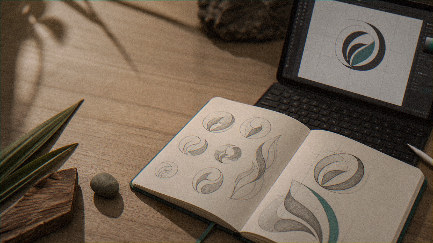
When people come to us for a logo, we usually end up talking about something bigger: a tohu.
A logo is a mark. A tohu carries your identity. Your whakapapa, your story, your place. For marae, iwi or hapū organisations, that difference is everything. So here's how we actually go about it, and why the order matters.
1. A tohu is more than a logo, it carries your identity
A logo is something you look at. A tohu is something you belong to.
It's not decoration you pick off a shelf. It holds who you are, where you're from, and what you stand for. Get that right and it does quiet work for years. Your whānau recognise it, trust it, and feel it's theirs.
That's why we don't start with "what should it look like." We start with who you are.
2. It starts with whakapapa, not pixels
A good tohu comes from your story. Your whakapapa, your history, a place that matters, a whakataukī, a karakia, or the meaning sitting inside your name.
Before anyone opens a design tool, we sit in that kōrero. What's the story only you can tell? What's the place, the tūpuna, the moment, the words that hold your kaupapa? That's where the tohu comes from. Not from a trend, and not from our guesswork. Sometimes the whole thing grows out of a single line of karakia, or the meaning of the name itself.
3. The pattern comes through the tohu
Once the tohu is right, the rest of the brand grows out of it.
The pattern, the colours, the way it all feels, they come through from the tohu, not bolted on afterwards. Often the brand pattern is lifted straight out of the tohu itself. So everything matches, because it all comes from the same source. Your tohu, your pattern, your palette, all telling one story.
Here's what that looks like. Take Manaiakalani, the education kaupapa we did a brand refresh for. Their tohu is the hook from heaven, Te Matau a Māui, the fishhook that lifts communities up. We sharpened that hook so its meaning held at any size, pulled a standalone hook mark out of it for the small spaces, and grew the pattern and palette around it. The whole brief to ourselves was to keep the integrity of that layered meaning, and not stray too far.
4. Everyone has a say, not just those at the tēpu
A tohu belongs to the people, so it's worth bringing the people into it.
The board and the decision-makers have their part, of course. But a tohu lands differently when the whole whānau, the wider rōpū, the people who'll carry it every day, get a say too. When you can, take the question out wider, not just around one table. We've done that, and it's what makes a tohu feel real, because everyone can see themselves in it.
The more of your people who get a say, the more the tohu truly belongs to everyone.
5. Kōrero before tohu. Tohu before anything else.
Order matters, and this is the order.
First the kōrero, the story and the meaning. Then the tohu, grounded in that kōrero. Then the wider branding, the pattern, the colours, the voice, grown from the tohu. And only then the build: the website, the systems, the merch, all of it.
Skip the order and you spend later trying to retrofit meaning onto something that was chosen for how it looked. Do it in order and everything downstream has something true to stand on.
6. The little things: tikanga and sign-off
This is where it's easy to slip, and where doing it properly really matters.
If a tohu, a name or a design carries something that belongs to others, you ask first. Have we got sign-off from mana whenua, especially if we're naming a building or a space? Do we need a kaumātua or a local iwi representative to give it the okay too? Are we using a pattern or a name that needs permission?
Sure, it can be a bit of a hurdle. But it's the right way to do things, and it's these little things that matter, the ones that make the difference between a tohu that's tolerated and one that's truly embraced.
The Hono way
We're a Māori owned digital agency, and as Māori brand and logo designers, this is the part of the mahi we love most.
A tohu done right isn't flash for the sake of it. It's your identity, uncovered with your people, grounded in your whakapapa, and honoured with the right tikanga. Everything else, the branding, the website, the merch, grows from there.
If you're thinking about a new tohu, or your current one never quite felt like you, that's exactly the kind of kōrero we're here for.
Common pātai
What's the difference between a logo and a tohu?
A logo is a mark. A tohu carries identity, your whakapapa, your story, your place. We design tohu, so the meaning comes first and the visual follows.
Where does a tohu come from?
Your story. Your whakapapa, your history, a place that matters, a whakataukī, a name, a karakia. We start in that kōrero before anyone designs anything, so the tohu is grounded in who you are, not a trend.
Do we need sign-off from mana whenua?
Often, yes, especially if a tohu, name or design carries something that belongs to others, or you're naming a building or a space. Asking first (mana whenua, a kaumātua, a local iwi representative) is the right way to do things. It can even be a blessing, and it makes sure the tohu is done right and truly embraced.
Image Gallery
Explore our vibrant collection of hononga moments.
Let’s connect
and collaborate!
Ready to tidy up your systems and get the mahi flowing?!!
.png)
.png)
Explore Our Recent Insights
Discover valuable content to enhance your connections.
Ask ChatGPT for a Plumber in Tauranga. Go On. We'll Wait.
We’ve been a little quiet on our channels recently